Sunday, December 13, 2009
On and on and on...
I am continuing to experiment. I haven't yet found something I am satisfied with, but I am very much enjoying my new SLR camera.
Saturday, December 12, 2009
Alive
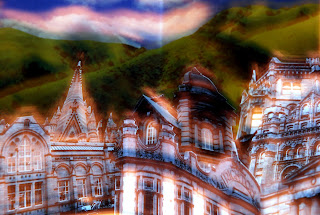
Adding contemporary component, and experimenting with shutter speed. Representing the busy city of Manchester.
Photography. Historical and Contemporary Contexts.
NZ Book Council - Going West
One of the most incredible, beautiful, animations I have ever seen. WATCH IT. Produced by Colenso BBDO Animated by Andersen M Studio.
Sunday, November 29, 2009
Wednesday, November 25, 2009
Disruption - Sound & Vision
This project is concerned with exploring the boundaries of your own interests with the aim of encouraging you to develop a personal graphic language. Make a map of the piece of music you've chosen - There is no specific format for this project and you can utilise any media.
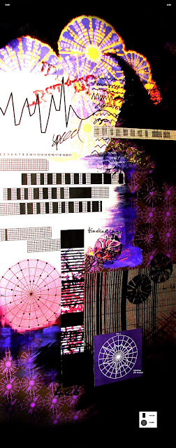
With the chosen song Superstition by Stevie Wonder, I had to find ways of mapping the song. I first started looking at the reasons I like the song, such as the 70s disco genre and the catchy melody, and I made a key for each of the factors: Genre, melody, lyrics and beat, creating a circular pattern - taking inspiration from 70s wallpaper.
Looking at different information to record, I listened to the song and recorded the presence of the lyrics throughout the whole song- at each second the lyrics stop and start. I then tried different ways of creating a time-line to represent this information.
I experimented with drawing to the song. I drew a continuous line to represent the speed, volume and presence of lyrics or instruments. For the lyrics I drew the line with scribbles to represent text and when the music became louder or faster the line became wider. I also worked out the speed at which the lyrics were sung. I calculated the speed of each line of the lyrics, by counting the number of syllables and dividing this by the time in which it was sung.
I explored a number of methods of plotting information and I practiced different mediums including drawing, lino print, digital work and painting. The song is lively and jazzy, and deciding I wanted my map to reflect this, I combined my assortment of experiments into one collage that I then photographed. I wanted it to look busy and be full of information about the song. I did not want it to be too obscure but neither did I want it to be too explicit, so I tried to create a balance by just giving a hint at what it means. I placed a key at the bottom of the page to try and explain some of the abstractions, and I labeled the top of the page with the time to suggest the idea of the time-line to make sense of the graphs. I gave labels to some of the other maps for further explanation. I like the idea of this map being a puzzle - you are given a number of clues to try and work out the song. This piece of work possibly could work as a music poster.
Simon Periton
Periton's has created an array of gorgeously vivid pieces through drawing, painting, sculpture and paper cut-outs. He creates doilies through paper cut-outs and uses them as stencils creating colourful abstractions with spray paint. Although delicately produced, materially lightweight and sometimes frail, his work is full of powerful images that subvert the idea of the cosiness and the calm of doilies: Skulls and foliage are mixed with found imagery of soldiers and anarchy signs which give a sense of oppression even through all the bright attractive colour. Subjects such as Wallis Simpson, the Sex Pistols, Iggy Pop, and William Morris also appear in his work which again contradict his materials and process.
Neasden Control Centre
One Dot Zero: Wow and Flutter Remixed from neasden control centre on Vimeo.
Neasden control centre, based in London, are a multi-disciplined studio that practices illustration, art direction, installation, typography, motion and film.
It "aims to continue to extend and develop involvement with diverse projects drawn from across different sectors - arts & culture, music industry, fashion and advertising both independently and collaboratively."
Their work is often lose and rough, using hand drawn type and layering text. You could say it looks a bit of a mess, and this sort of design would not have been accepted 10 years ago, but I think the hand made feel gives the studio an identity. Their work is lively, active and chaotically full of fascinating components.
Hopefully I will make an animation soon, its one area I haven't really explored but could be really great.
Tuesday, October 20, 2009
Zoom


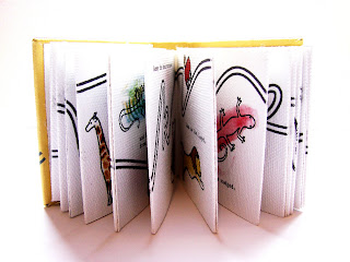
Summer project for university, a teeny weeny book that teaches children the alphabet, following a roller coaster ride that takes you zooming and looping through the letters. Each page of the story is written in alliteration, for the child to really grasp the sound of the letter as well as the shape.
Precision
Obsession
Monday, June 15, 2009
Barny Bubbles


Barney Bubbles was a renowned graphic designer, and remains an inspiration, who was best known for his graphic design associated with the British independent music scene during the 1970's and early 1980's. He has designed posters for such early 60s bands as the Rolling Stones and the Muleskinners, designed psychedelic light shows for the likes of Pink Floyd, did the art direction for underground magazines Oz and Friends/Frendz, and has over 150 record sleeve designs to his name, which he is most recognised for.
Subscribe to:
Comments (Atom)


