Sunday, September 26, 2010

Final film festival adverts... hopefully


Just dont know whether to do the leaflet, which will be concertina folded, reading downwards or across.

Leaflet


Designed leaflet as well which i'll make into a concertina book... think this is still a bit raw though, needs something to tie it all together.

Thinking about printing it on recycled paper too, I want the festival to be green! For hippies like me.

More layouts...


Me being indecisive as per, some more layouts for this poster... just cant decide which ones better! Ive looked at these so many times now I just can seem to be able to look at them with the right critical eye... have no idea if they're any good or not!

Tuesday, September 14, 2010

Engross Film Festival


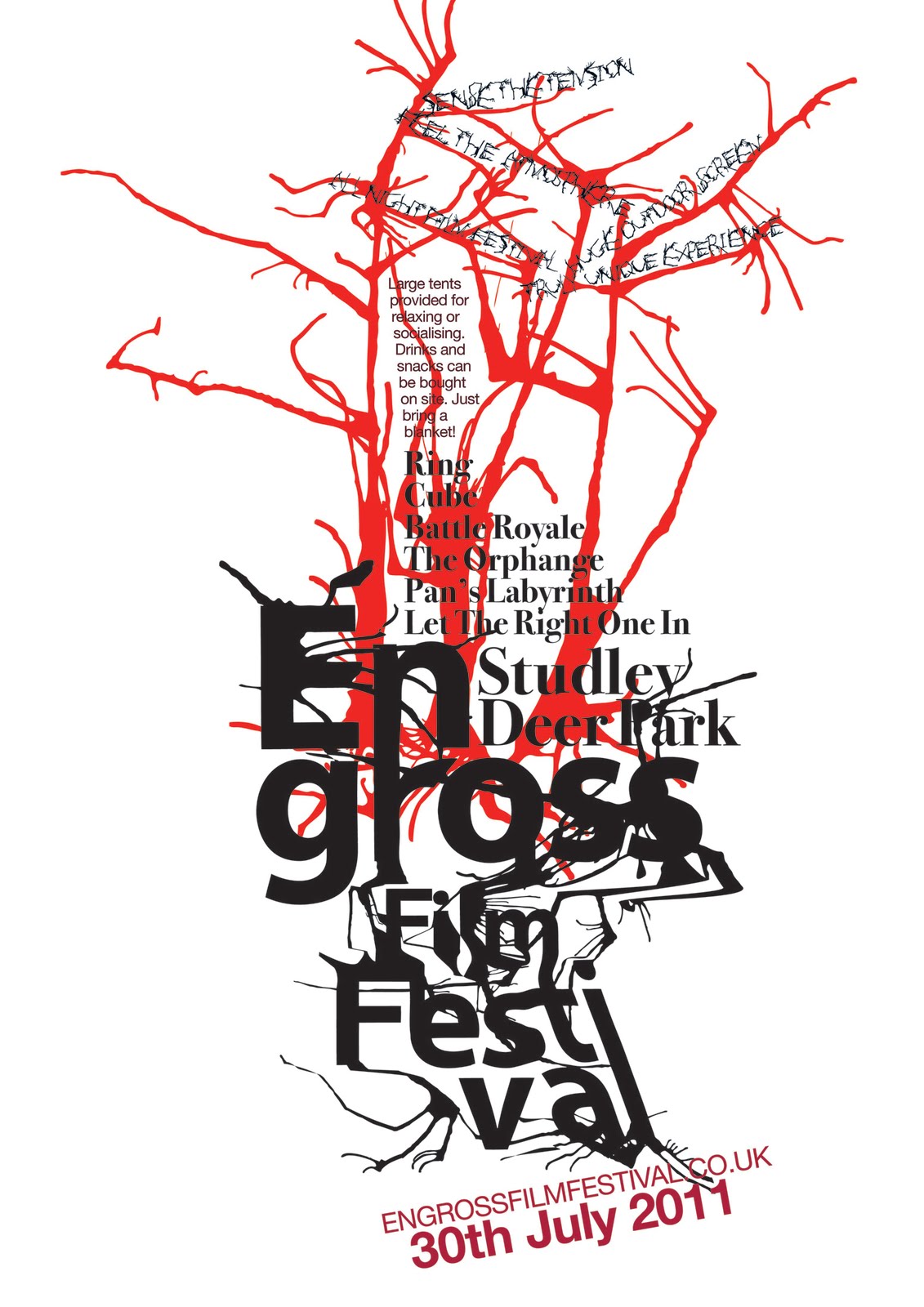
Summer project from university asked us to invent and design a film festival that shows alternative 'arthouse' films. My imaginary film festival is set at Studley Deer Park, a park near my home town that is extremely picturesque and full of lovely trees and wildlife and streams and the such. It is a gorgeous place to walk during the day, but I imagine that during the night it could be rather haunting, with the open space, trees, and darkness looming around you and above you. And I thought the idea of an outdoor screen here showing films, when you are surrounded by the darkness and the cold, the quiet, the wind and rain, could be quite a fantastical experience. So my film festival is an all night event. It will show the films: Ring, Battle Royale, Pans Labyrinth, The Orphanage, Let the right one in, and cube. I hoped that 'Engross' with the double meaning engross and gross would suggest and idea of the films. I didnt want a word that was too pretty. The films are strange in that they are beautifully presented but in a gruesome way - almost like they make blood look attractive. They portray quite shocking and disturbing ideas, and distort beauty - its not typical!

So the films are both beautiful and ugly, at the same time if that is possible... so that is how I have tried to create my adverts! Using an ugly name, trying to create an attractive layout, using a classic elegant font for the film titles and the place names. The films are also very surreal and imaginative which is another theme I was trying to get across - by making everything a bit distorted.

Hmmmmmm... hoping that these posters are portraying these ideas!

Sunday, September 12, 2010

Work Experience

During the summer I did a week work experience with a graphic designer, Ian Ladley, who owns the company Graphic Attic which is based in Harrogate. Over the week I worked on advertisements and logo design. I was given guidance and instruction as to what it was the client was looking for - as Ian new the clients much better than I could, but I had creative control over the design.

The experience gave me an invaluable insight - graphic design in the context of earning money is often about doing something simple, quickly. It may have to be design that is not to your taste - it has to be to the clients taste and if they are happy it is them that pay. A graphic design career will always be a constant struggle between having to please the client and earning money, and wanting to be creative and love what you are doing.

I was as creative as I could be with the projects I was given and I had to speed up my designing. I learned a few extra techniques in Indesign, as well as learning Quark for the first time. Also had good experience working under pressure and meeting deadlines because it was a very busy week, which I rather enjoyed.

The work I produced was definitely not highly imaginative, but it was good experience with creating appropriate design and layout quickly.